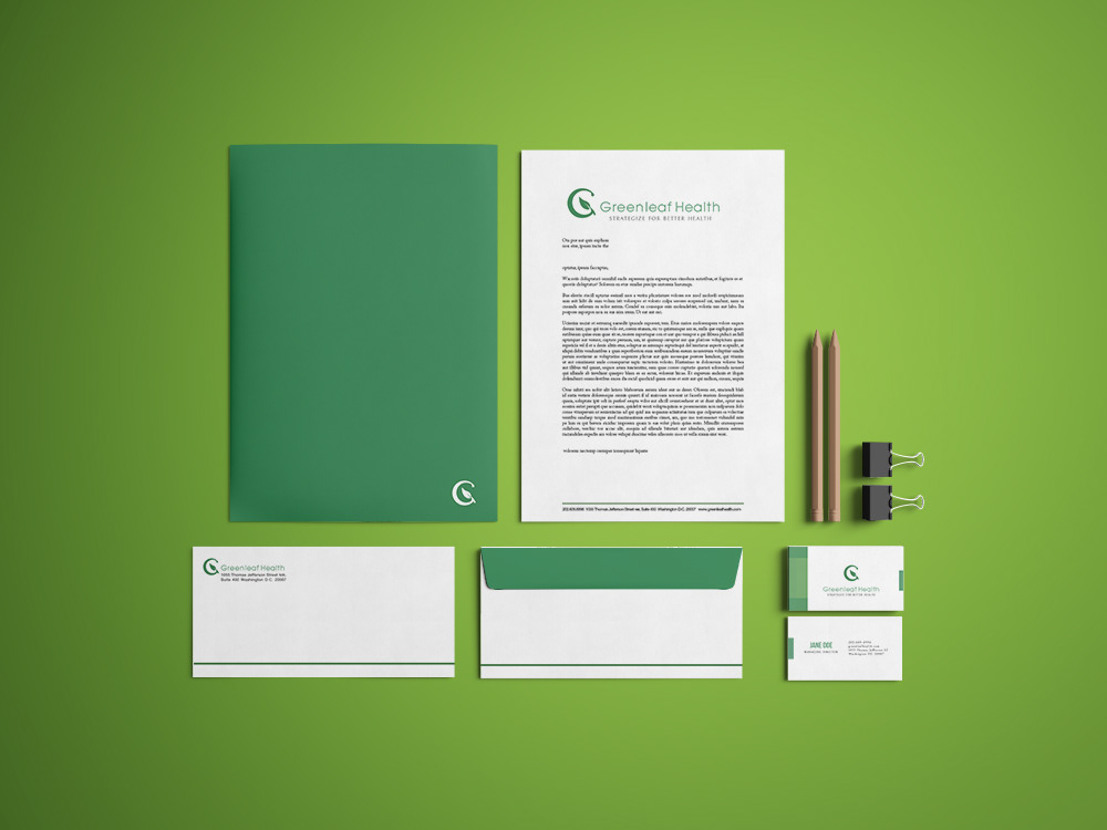
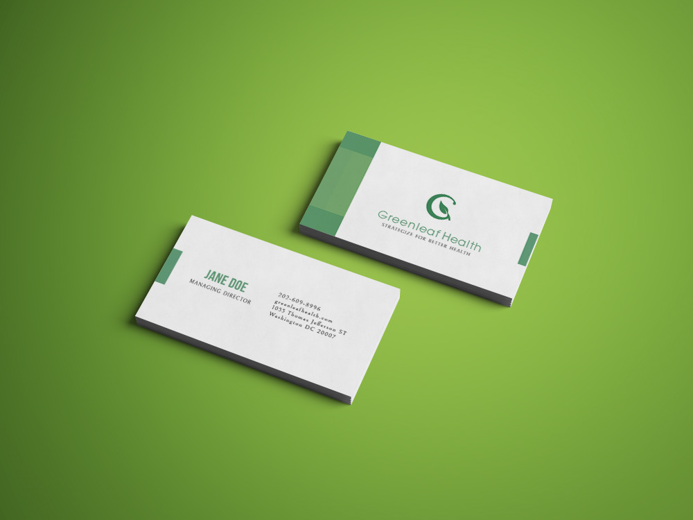
Greenleaf Health was a project brought to me by a third-party client. They were seeking a rebranding of the brand. This project became a personal one, because I'm rebranding the earlier work I did. Greenleaf is an FDA regulatory consulting firm that specializes in consulting pharmaceutical companies in how to meet the appropriate regulations to have their products approved.
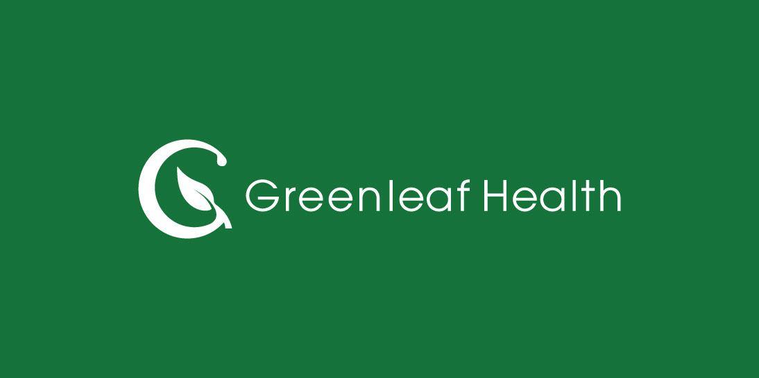
The logo was designed with the approach of creating something with a contemporary feel, while communicating health, nature, and science – all in one. One major goal was simplicity, because the company would also need their logo to have an icon that can communicate their brand separate from the text – and to be used for their mobile app. The G from Greenleaf, was combined with a plant, using the G’s stem to create the stem of the leaf. The terminal of the G, at the very top, is given the shape of a water drop. This depicts an image of water nourishing the seed, which grows into a leaf. This signifies the company’s growth, and their ability to consult other companies to grow, while referencing the company name, and theme simultaneously. Not to mention, their mobile app is called SEED, which is also referenced through the logo. The colors complement the company’s name, and the lettering was chosen with a slightly thinner weight for simplicity, and contrast against the icon.
Note – This is a personal redesign of the company logo, and this does not reflect on the actual company – being that the client was a third-party.