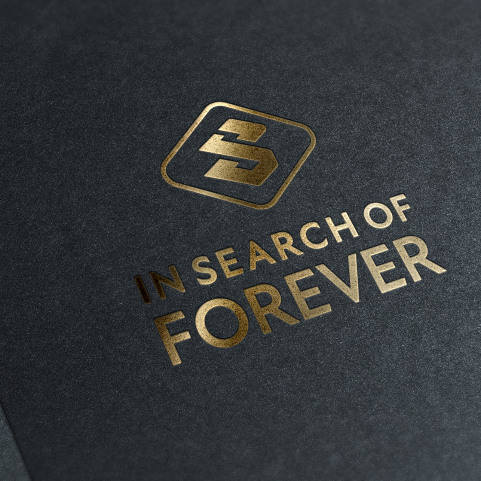
J. Alias was a branding project started for a music producer. This was a personal design for his artist’ brand, while simultaneously a separate brand for his company -- In Search of Forever LLC was being created. The goals of this branding project were to design a simple, but capturing type-based logo, that can illustrate the overall tone of J. Alias’ music, and distinguish the brand from competitors.
The major objectives during this logo design, were to maintain simple, clean lettering – with a unique twist and modern feel. I sought for a style of lettering that communicated sophistication, and rich in quality as a way to match the feel of the type of music J. Alias produces. The colors of Yellowish Gold, and the deep royal blues were chosen as a complementary to the heavy kerning, and bold weights of the lettering. All capital letters were chosen as another way to emphasize the boldness of the type. The shape of the letter ‘J’ almost resembles an ear ( a visual nod to music production) -- and the top and bottom lines were created to not only frame the lettering, connecting the remaining ‘Alias’ with the letter ‘J’, but create a heavy sense of geometry – exactly what my client was seeking in the design.


