Total You, an herbal and nutrition company the specializes in supplements. The company was seeking a redesign of the label packaging, which had previously been bloated with information, and lacking any real visual hierarchy. It felt overcrowded -- and so the new design incorporates white space, and clear groups of visual information, to create a look of professionalism and allow for easy navigation for the consumer. They can read the bottle far easier and far more quickly. Strong geometric shapes were used to frame the label and subconsciously guide the eye through the design.
Total You
You may also like

2019
Misc. Logo Designs
Click to see more about the project.
2019
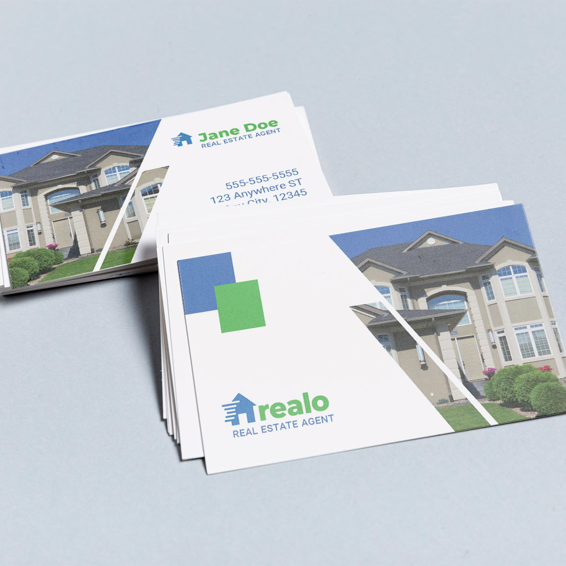
Realo - Web Design
Click to see more about the project.
2019
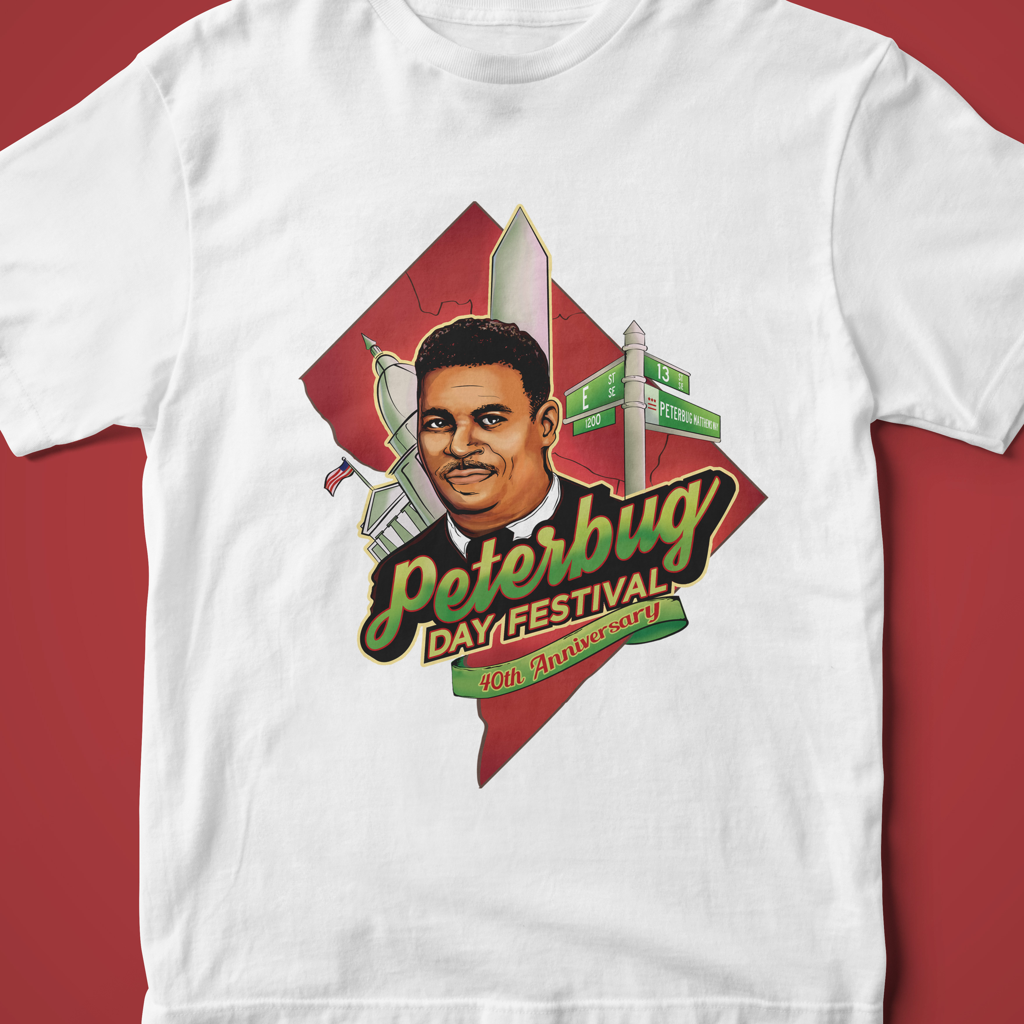
Peterbug Illustration
Click to see more about the project.
2019
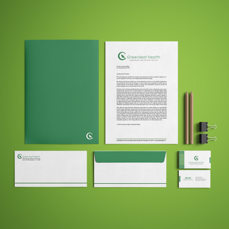
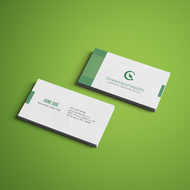
Greenleaf Health
Click to see more about the project.
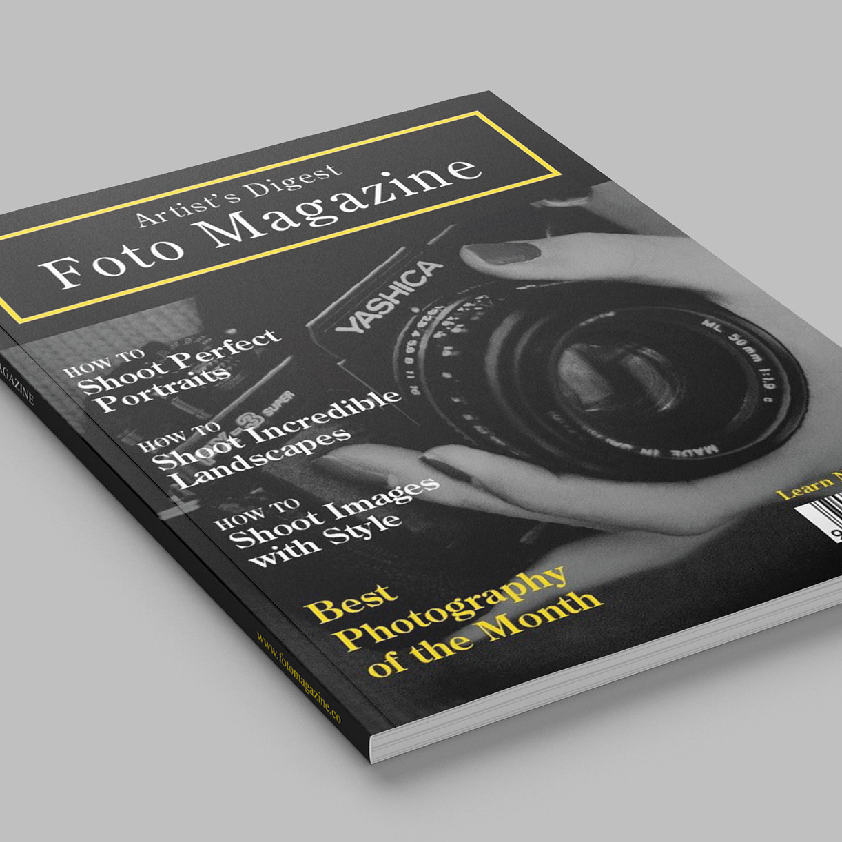
2019
Publication Design
Click to see more about the project.
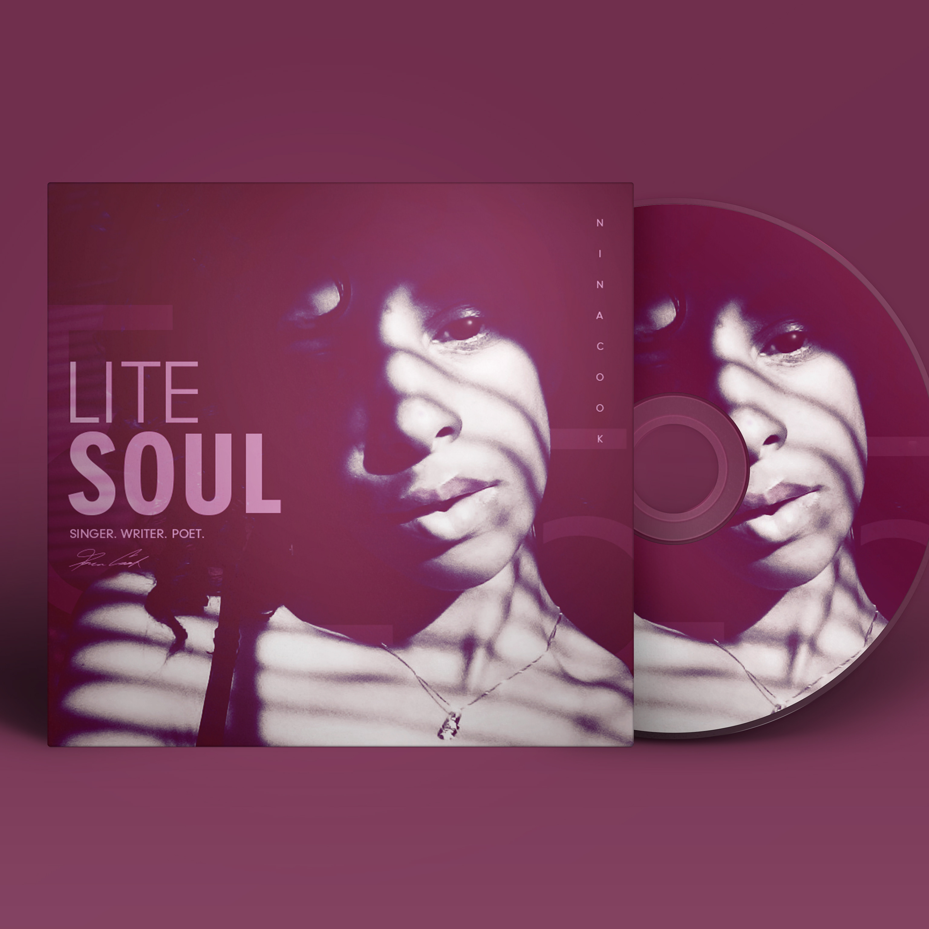
2020
Artist - Nina C. Promo Art
Click to see more about the project.

2019
J. Alias Logo Design
Click to see more about the project.
2019
In Search Of Forever
Click to see more about the project.
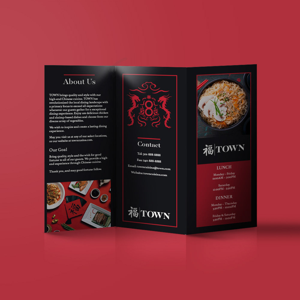
2019
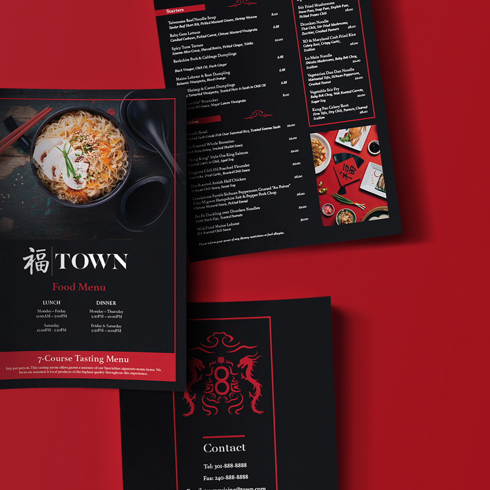
TOWN Restaurant
Click to see more about the project.

