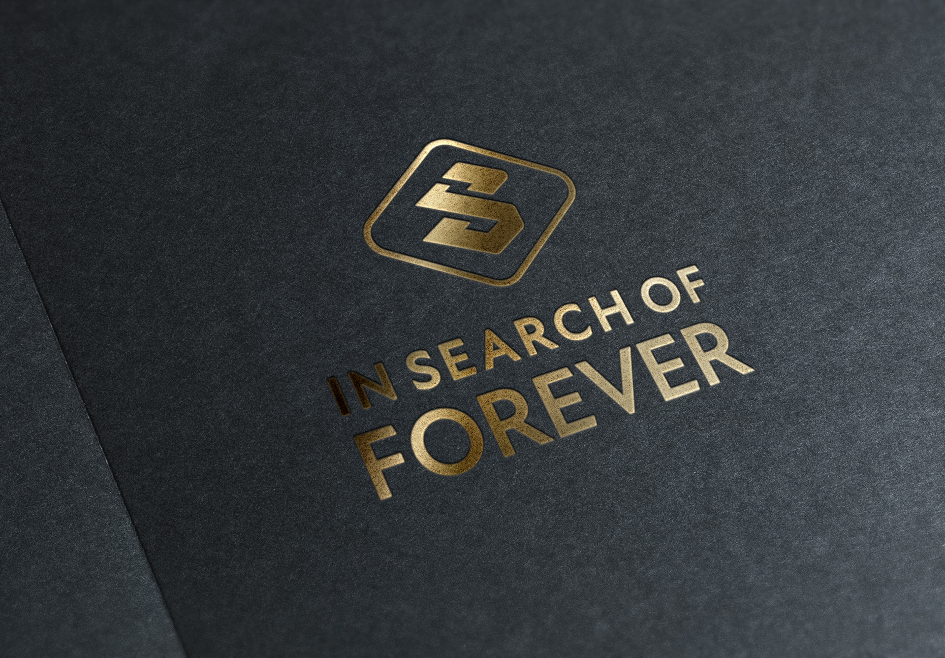
This project was the branding for In Search of Forever LLC, a production studio. Here, the client wanted a geometric, simple, logo design that possibly manipulated the lettering. The main goal was to create a logo that could be used as an icon in the future -- separate from the text for the company name.
An S was modeled to represent 'search'. It was then altered and manipulated to resemble an infinite sign as well. This depicts the 'searching forever' -- also found in the company name. The shape was then enclosed inside a diamond, to provide framing, add complementary geometry (notice the same kind of rounded curves on the S shape) and to mean upscale & costly. This was another keyword my client wanted the logo to depict -- quality, expensive, fancy.